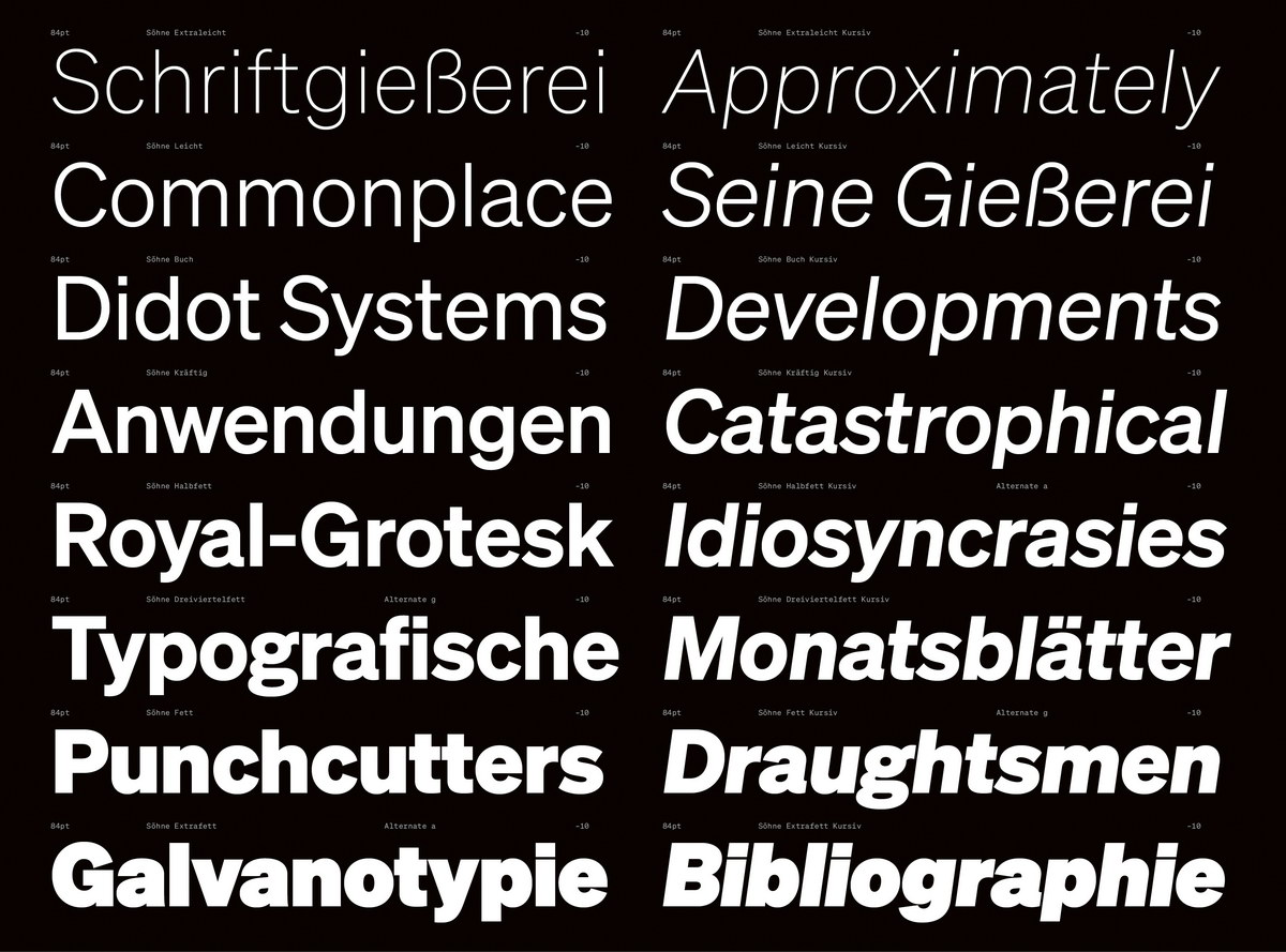
Söhne是sans-serif字体家族的一个系列,是为纪念1898年诞生的Akzidenz-Grotesk字体而设计出来的。Akzidenz-Grotesk在当时可谓是字体设计的一个重要里程碑,也是许多后来的字体设计(例如Helvetica)的最初原型。这个系列的灵感来自Unimark传奇性的纽约地铁寻路系统,地铁系统一般情况使用的字体是在美国发行的Akzidenz-Grotesk标准版字体,随后又使用过Helvetica。 “通过现实中Helvetica字体来构筑”,Söhne系列捕捉了Akzidenz-Grotesk标准字体中类似的元素,并保留了其原始风格的魅力。经过明显的修改设计,该系列字体显然适合如今的数字时代。该系列包括四个家族,共含有64种字体。设计时从Akzidenz-Grotesk一个多世纪的发展中的所有不同样式中汲取了灵感,从常规样式开始,每个字体样式让人感受到Akzidenz-Grotesk所历经的一系列时代变迁,并向现代设计师展示了一套完整的当代字体家族。
The Söhne collection is a sans-serif font family that was developed in memory of Akzidenz-Grotesk that appeared in 1898 – back then a milestone in font design and a model for numerous later designs such as Helvetica. It was inspired by Unimark’s legendary wayfinding system for the New York City Subway, which was traditionally set in Standard Medium, an American release of Akzidenz-Grotesk, and since then in Helvetica. “Framed through the reality of Helvetica”, the style of the Söhne collection captures the analogue materiality of Standard Medium and retains the charm of its original style. Noticeably revised, the collection is clearly suitable for our digital age, comprising four families with a total of 64 fonts. Starting with the regular styles, the collection travels through the famous history of its role model in that it draws inspiration from all its disparate styles over a century of development and presents itself as a complete, contemporary typeface family for modern designers.
获奖作品推荐